Color System
How It Works
You only need to pick two colors in Theme Settings. Everything else is generated automatically.
Brand Color  →  sidebar background, navbar, login page
               + auto-generates: hover tints, border colors, page background tint

Accent Color →  buttons, active sidebar item, highlights
               + auto-generates: button hover state, pressed state
Solvronix Desk uses CSS color-mix() to derive the complete color palette from your two inputs. Change your brand color once and every derived color — backgrounds, borders, shadows, tints — updates instantly across the entire interface. No developer needed.
Quick Color Presets
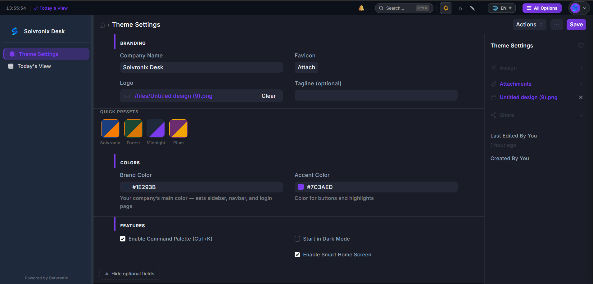
Four one-click presets appear above the color pickers. Click any swatch and both Brand Color and Accent Color fields update instantly — then click Save to apply.
| Preset | Brand Color | Accent Color |
|---|---|---|
| Solvronix | #1B3F7E Navy | #F57C00 Orange |
| Forest | #2D6A4F Green | #D4A017 Gold |
| Midnight | #1E293B Slate | #7C3AED Violet |
| Plum | #6B21A8 Purple | #F59E0B Amber |
Use a preset as-is or as a starting point before tweaking the hex values to your exact brand colors.
Default Colors
| Color | Hex | Used For |
|---|---|---|
| Brand | #1B3F7E | Sidebar, navbar, login page |
| Accent | #F57C00 | Buttons, active items, highlights |
| Page Background | Auto-generated | Light tint of brand color |
| Cards / Forms | #FFFFFF | All content surfaces |
Choosing Good Color Combinations
- Brand Color should be a mid-to-dark tone (works well as a sidebar background)
- Accent Color should be bright enough to stand out against white card backgrounds
- Avoid very similar brand and accent colors — contrast helps users identify interactive elements